Appendix 1: Guide to interpreting figures and tables in this report
Average
The average is calculated by summing all values and dividing by the total number of values. This is also known as arithmetic average and mean.
Median
The median value is the actual midpoint of all values. It is the point for which 50% of values are below and 50% of values are above. Where any set of values has an even number, the median is the average of the two midpoint values.
Weighted median
The weighted median is an adjusted midpoint taking into account the number of employees at each classification. This approach allows for calculation of whole-of-APS, non-SES and SES median percentage changes in remuneration components. The larger the population of a classification or group of classifications the greater impact it will have on the result. Weighted median is an historical measure from successive remuneration reports.
Percentiles, quartiles and box plots
This report uses box plots to visualise the position of the 5th, 25th, 50th, 75th and 95th percentiles for Base Salary, Total Remuneration Package (TRP) and Total Reward (TR).
Percentiles mark intervals where data occurs, in relation to the whole dataset. The 25th and 75th percentiles are referred to as Q1 and Q3 respectively. These intervals are described in the table below.
Table A.1 Percentiles used in this report
| Percentile point | Also known as | Percentage of data below point | Percentage of data above point |
|---|---|---|---|
| 5th | P5 | 5% | 95% |
| 25th | Q1—First quartile | 25% | 75% |
| 50th | Median | 50% | 50% |
| 75th | Q3—Third quartile | 75% | 25% |
| 95th | P95 | 95% | 5% |
Example box plot elements
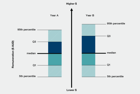
Figure A.1.1 shows box plots of Base Salaries paid to employees at a given classification in two consecutive years. The horizontal axis shows the years, A (left column) and B (right column) and the vertical axis represents the amount of money paid.
In each set of 4 boxes (one set for each year), the percentiles are represented by horizontal lines and are labelled at their appropriate positions for P5, Q1, Q3 and P95. The median is represented by the thicker middle line. The minimum and maximum values are not represented in these box plots to reduce the visual impact of outliers on the chart.
The box colours are different to distinguish between intervals and focus your eye on the spread of data from the first to third quartile (Q1 to Q3), where the majority of data lies. The colours have no other meaning.
A larger box between percentiles indicates a greater range of data points between the largest and smallest values in that interval, in this case, Base Salaries paid. A smaller box indicates a greater concentration of data points within a smaller range.
Therefore, in year B, the pay range increased at Q3—shown by larger distances between the median and Q3 relative to year A. In addition, there was no change in the 5th percentile, Q1 and median from year A to year B.
Figure A.1.1 Example box plots

Remuneration components
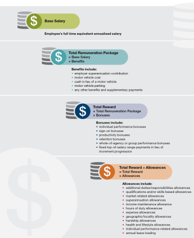
The key remuneration components covered by this report are Base Salary, Total Remuneration Package, Total Reward and Total Reward plus allowances.
Figure A.1.2 provides a visual breakdown of these remuneration components.
Figure A.1.2 Remuneration components

Additional notes on interpreting this report
- Some columns in the data tables at Appendix A.3 may not add up because TRP and TR are calculated separately for each employee. These are the values that determine the median. Therefore median TR is not always the sum of all medians for Base Salary, TRP and TR.
- Data from this report should not be used to calculate past or present populations of the APS. For accurate data as at 31 December 2021, please refer to the 31 December 2021 APS Employment Data Release, which is available from the APSC website:
https://www.apsc.gov.au/employment-data/aps-employment-data-31-december-2021
- Data is analysed and tabulated using several different propriety software packages which may lead to minor variances in data reported between tables. These differences are also evident when trying to recalculate values based on the data in the reports in common programs like Microsoft Excel.
- Changes in software used to analyse and produce the APS Remuneration Report occurred in 2017, from SAS to Tableau. This has resulted in minor changes to how the reported distribution data is calculated due to the two programs using different, patented methods for calculating percentiles when even numbers of observations occur. Such differences in calculations have had a minor impact on the position of percentiles that were reported in previous years.
- Therefore it should be noted that the data reported for previous years as presented in the current edition of the APS Remuneration Report will differ from reports published prior to 2017.
- Population data used for analysis in this report is based on data from the APS Remuneration Survey unless stated otherwise. This will differ from published APS Employment Data due to a different collection scope.


